A Closer Look at New York’s Ride Demand

What New York City’s ride pattern reveal about reliable service, taxi competition and the limits of growth.
A trip leaves a record of where someone started and where they ended up. Look across a day, and those records can describe a rhythm: residential neighborhood sending people out in the morning, Midtown drawing them in, then a different balance by evening.
My interest in this comes from my previous experience in fleet operations at a taxi company in Indonesia. I wanted to explore familiar operational questions in a different city. New York’s yellow taxis felt like a natural starting point: I had seen them in so many films, and I was curious about how the business behind that familiar image had changed.
The question behind this analysis is how for-hire ride demand varies across time and location in New York City, and how those patterns might inform more efficient fleet positioning. It brings together NYC TLC trip records for Yellow Taxi, Green Taxi, and High-Volume FHV, or Uber/Lyft, with daily weather observations from Central Park. The detailed daily analysis covers 2025. Comparisons with 2024, a policy review spanning 2019 - 2026, and recorde through August 2026 put those patterns in a wider context, followed by an outlook for the rest of 2026.
For the detailed 2025 analysis, cleaning 293M raw records retains 289.7M valid trips. Uber/Lyft account for 84%, and the geography covers 263 taxi zones. But the data collected are completed trips. They do not show the requests that went unserved.
To see that missing part, I would need records of ride requests and their outcomes, including cancellations and requests that never found a driver. That would mean seeking additional data through a TLC records request or directly from Uber and Lyft, with no guarantee of access or complete coverage. This analysis stays what the public records can show: completed trips, and signs of strain around them.
The starting point is when rides happen, from the rhythm of a weekday to the changes across seasons and holidays. From there, I look at pick up and drop off locations, and what those flows suggest about where the supply of vehicles may be needed next. Wait times, weather, and evening airport demand help show why those patterns matter to riders. How much can external factors affect the shift in customer demand? The article then looks at competitions, policy, and the changing market in 2026, before considering what a different positioning plan could achieve–and how to test it. The distinction running through the analysis is between completing more trips and making a ride more dependable.
In this article:
When demand gathers
Where vehicles move
What riders experience
xHow the market is changing
Policy changes and the evidence
What positioning could look like
01
When demand gathers
A year of rides in NYC
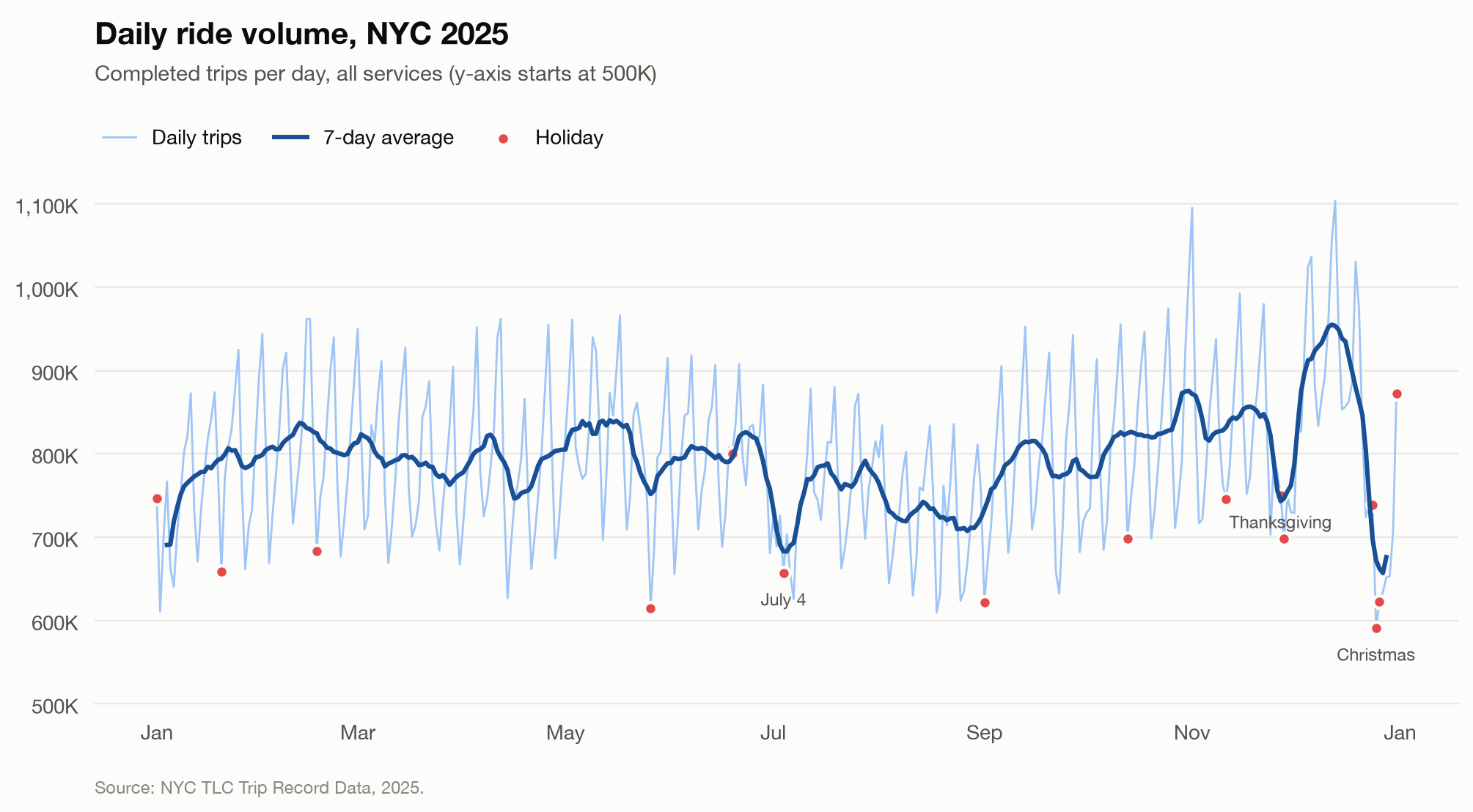
Figure 1. Daily completed trips across all services in 2025. The darker line shows the seven-day average; marked holidays provide calendar context.
In 2025 New York City averaged 793,655 completed trips per day. Figure 1 shows how daily volume changes through the year. The weekly pattern in Figure 2 shows taht Saturdays at 7 PM is the busiest hour, averaging 54.7K trips. Tuesday at 3 AM is the quietest, at 5.2K. There is about a tenfold difference between them. A fleet positioned for one of those hours would face a very different market in the other.
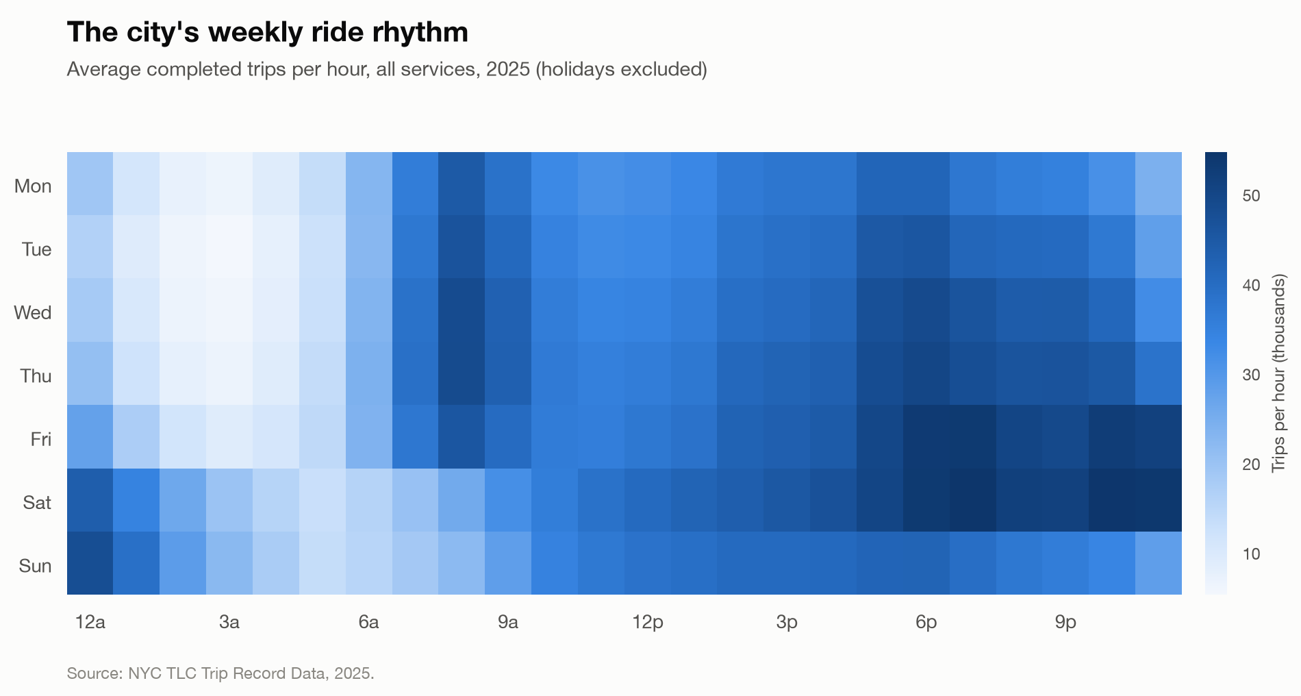
Figure 2. Heat map of weekly completed rides across all services, excluding holidays. Saturday evening and Tuesday before dawn mark the busiest and quietest hours.
Even within the same weekday, the services follow different patterns. Uber/Lyft demand peaks at 8 AM. Yellow Taxi demand peaks at 6 PM and stay high until about 10 PM. Those peaks establish when demand gathers within a day. But the volume behind that rhythm also changes across the year.
The same day, in a different month
Monthly averages put that daily rhythm in context. In the cleaned 2025 data, average daily Uber/Lyft trips stay within 7% of the service’s average month. Yellow Taxi varies more: about 106.6K trips/day in January and 107.2K in August, compared with 137.5K in May. Comparing trips per day keeps the different lengths of months from imbalancing the comparison. Yellow Taxi’s January and August averages about 15% below its average month, with the peak in May.
The monthly profiles in Figure 3 also resemble those in 2024, especially for taxis. Yellow Taxi’s January and August lows appear in both years. The monthly correlations are 0.93 for Yellow Taxi, 0.91 for Green Taxi, and 0.73 for Uber/Lyft. These correlations describe how closely the monthly patterns move together. They are consistent with a recurring seasonal pattern, although it does not tell us whether vacations, travel or other changes in routine account for the pattern
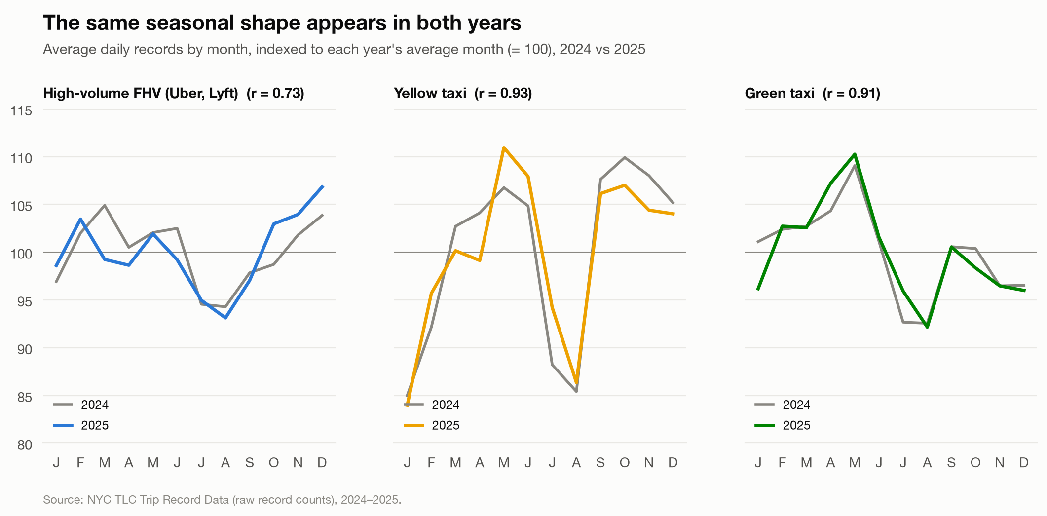
Figure 3. Average daily raw records, indexed to each service’s average month within each year. The comparison shows the shape of demand, not growth in trip totals. These are uncleaned records and cleaning rates may differ between years. Similar patterns are consistent with seasonality, but do not identify its causes.
The calendar adds another qualification. In a separate daily model that accounts for month, weekday, weather, and the year-end period, holidays are associated with 4.8% fewer Uber/Lyft trips and 18.6 fewer Yellow Taxi trips. The model also finds a separate lower-volume association during December 24-31, right around Christmas holidays. For planning, this suggests checking which kind of day is ahead before applying an ordinary weekday pattern.
The seasonal shape can repeat while the overall level changes. In raw record counts, Yellow Taxi grew 18.3% in 2025, with growth of 13-27% in every month compared with 2024. Green Taxi fell 10.4%, with declines of 7-15% in every month, while Uber/Lyft grew 1.7%. Those are comparisons before cleaning, separate from the cleaned daily volumes above.
These broader changes give us context for how much demand to expect. Where vehicles should wait still depends on where those rides begin.
For an operator, the implication is to separate the recurring calendar from changes in the business. A seasonal fall that repeats across years calls for a different response from a service losing trips against the same months a year earlier. Treating both as a temporary shortage of riders could hide a competitive problem; treating both as a decline could prompt unnecessary cuts to capacity that would be needed again.
02
Where vehicles move
Where the trips begin
LaGuardia average 16.8K pickups a day across all services, followed by JFK at 16.2K and Midtown Center at 13.1K. Together, the top 20 of 263 zones account for 26% of pickups. Figure 4 shows where trips concentrate, but daily totals only tell part of the story.
These locations matter for different reasons. At the airports, evening pickups substantially exceed dropoffs alongside long Uber/Lyft waits. IN Midtown, the balance reverses between the morning and evening commute. A location receiving vehicles in the morning may need more arriving as the evening falls. Following those flows gives us a more useful guide to positioning than ranking the busiest places alone, though they still do not directly measure available vehicles or unserved demand.
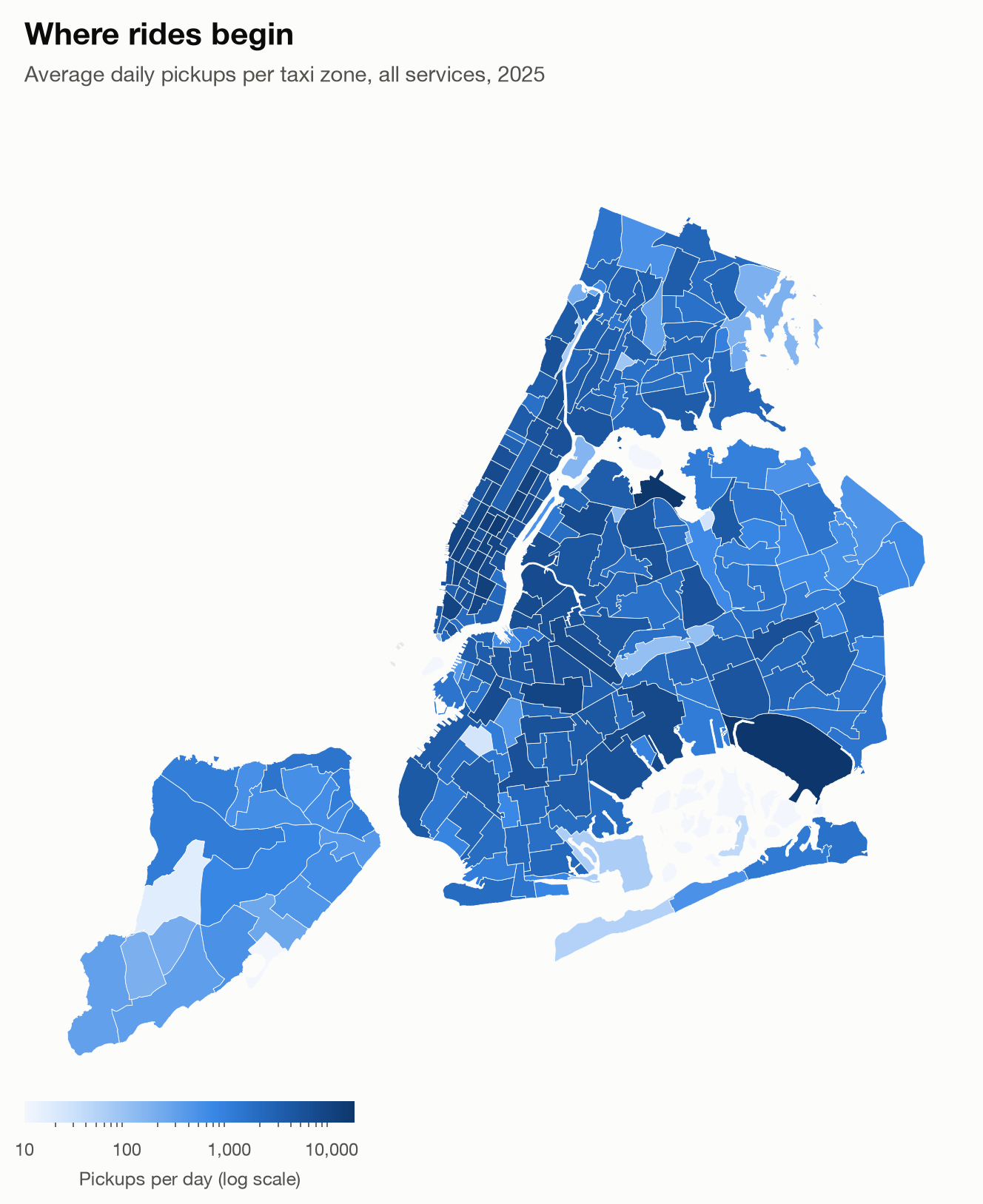
Figure 4. Average daily pickups by taxi zone, all services. The logarithmic scale makes lower-volume zones visible alongside the busiest locations.
Beyond that, the service mix changes with the neighborhood too. Yellow and Green Taxis hold about 41-52% of pickups in parts of the Upper East Side, Upper West Side, and Midtown. In most outer-borough zones, their share is near zero. To understand where vehicles might be needed next, we also have to look at where trips end, and how that balance changes by the hour.
That difference also matters when considering competition later in the article. Growth in taxis’ established Manhattan market would not, by itself, show that access had improved in the outer boroughs.
Before the morning commute
To understand where vehicles might need to wait, I compared trips starting in each neighborhood with trips ending there. Dropoffs bring vehicles into an area; pickups take them out on another trip. When more trips start than end, some vehicles must already be waiting there, arrive without passengers or begin their shifts there.
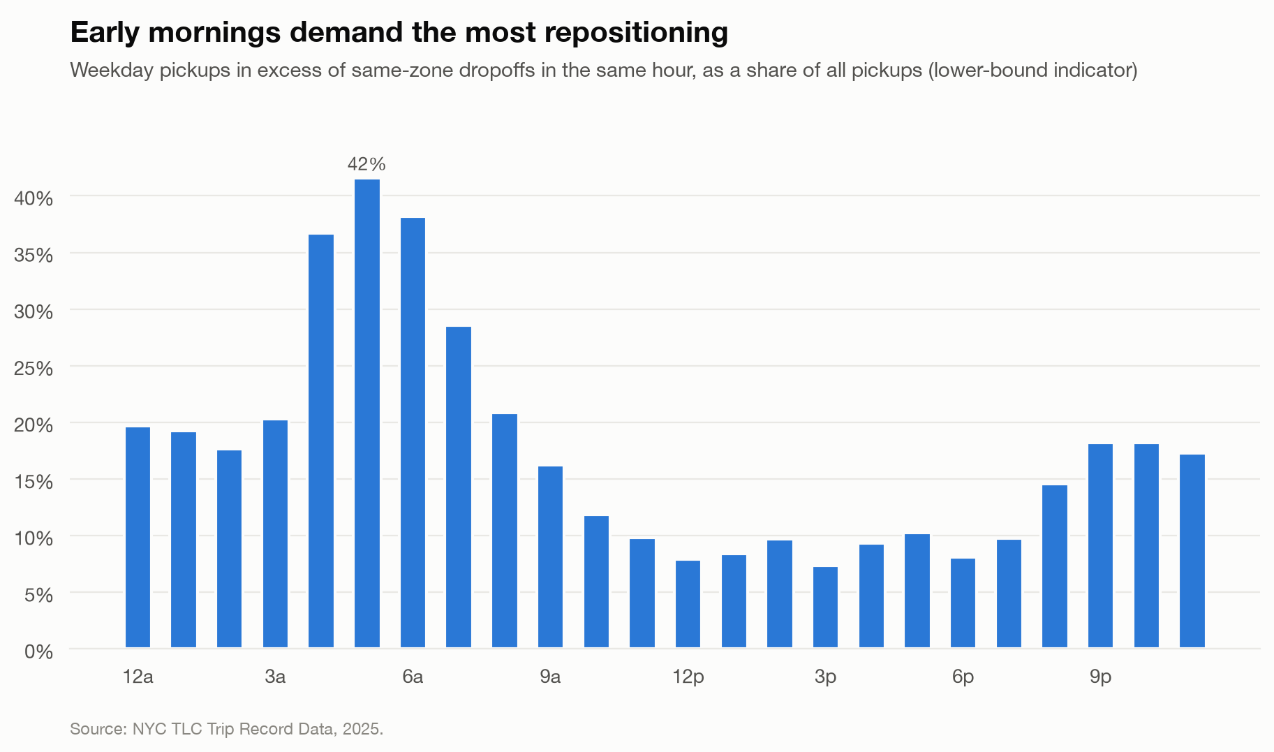
Figure 5. Local pickup-dropoff gaps as a share of all pickups, by hour. Only zones with more pickups than dropoffs contribute to the gap. This is an indicator of positioning need, not a count of unavailable vehicles.
In Figure 5, at 5 AM, pickups exceeding same-zone dropoffs reach 42% of pickups. By midday, that share is 7-10%. This compares trips starting in each zone with vehicles arriving through completed trips in that same hour. This does not mean that those rides went unserved:every ride counted here was completed. It shows how much the pickup flows relies on vehicles beyond those arriving through same-hour passenger trips.
The early-morning deficits point toward residential Manhattan and Queens: Astoria, +141 and Jackson Heights at +104 pickups minus dropoffs per hour. These are averages across the early-morning period, not counts of vehicles available at a particular moment. They suggest places to investigate before the commute develops. Midtown shows the other side of that flow
Midtown, in opposite directions
In the morning panel of Figure 6 below, at 8 - 9 AM, Midtown Center receives about 1,250 dropoffs per hour while generating 340 pickups, a surplus of roughly 900 vehicles/hr. Residential zones run deficits of 200-270 vehicles/hr. More passenger trips are ending in one place while new trips start elsewhere; whether those vehicles stay there is not observed.
In the evening panel of Figure 6, by 6 - 7 PM, Midtown Center has a deficit of about 500 vehicles/hr. The balance has reversed. The same place that received more vehicles in the morning now sends more trips out, chaning where supply needs to be positioned.
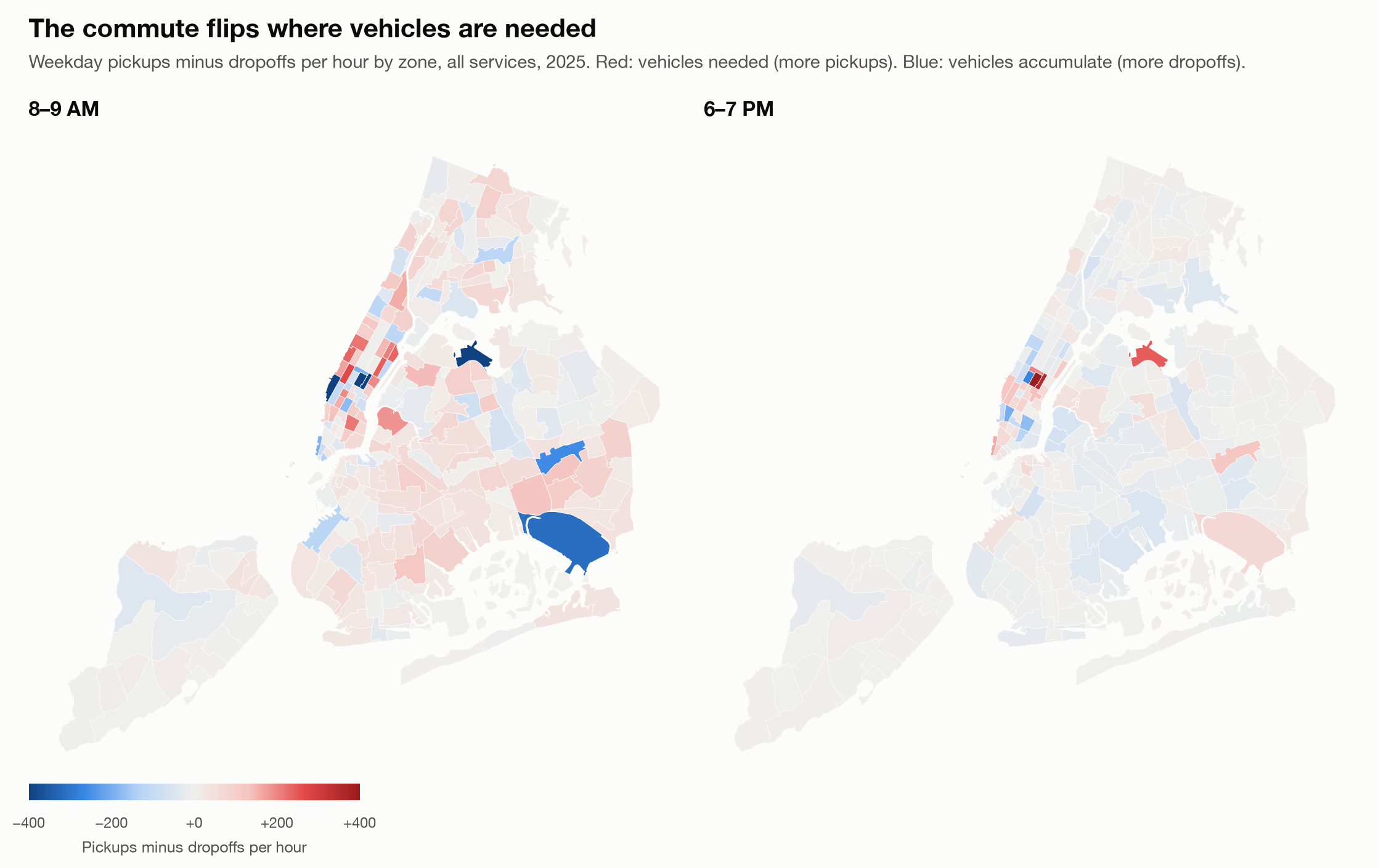
Figure 6. Weekday pickups minus dropoffs per hour, all services. Red indicates more pickups. Blue indicated more dropoffs.
03
What riders experience
Busy hours and long waits do not always coincide
The pickup and dropoff patterns suggest where to look for positioning problems. The next question is whether riders face difficulties in those places or at those times. Waits provide one measure of that experiences, while fares and speed describe the conditions around it. On weekdays (Figure 7), Uber/Lyft base fare per mile reaches $6.55 at 5 PM, compared with $4.10 at 3 AM. Average speed falls to 11.4 mph at 4-5 PM, compared with 24.7 mph at 4 AM.
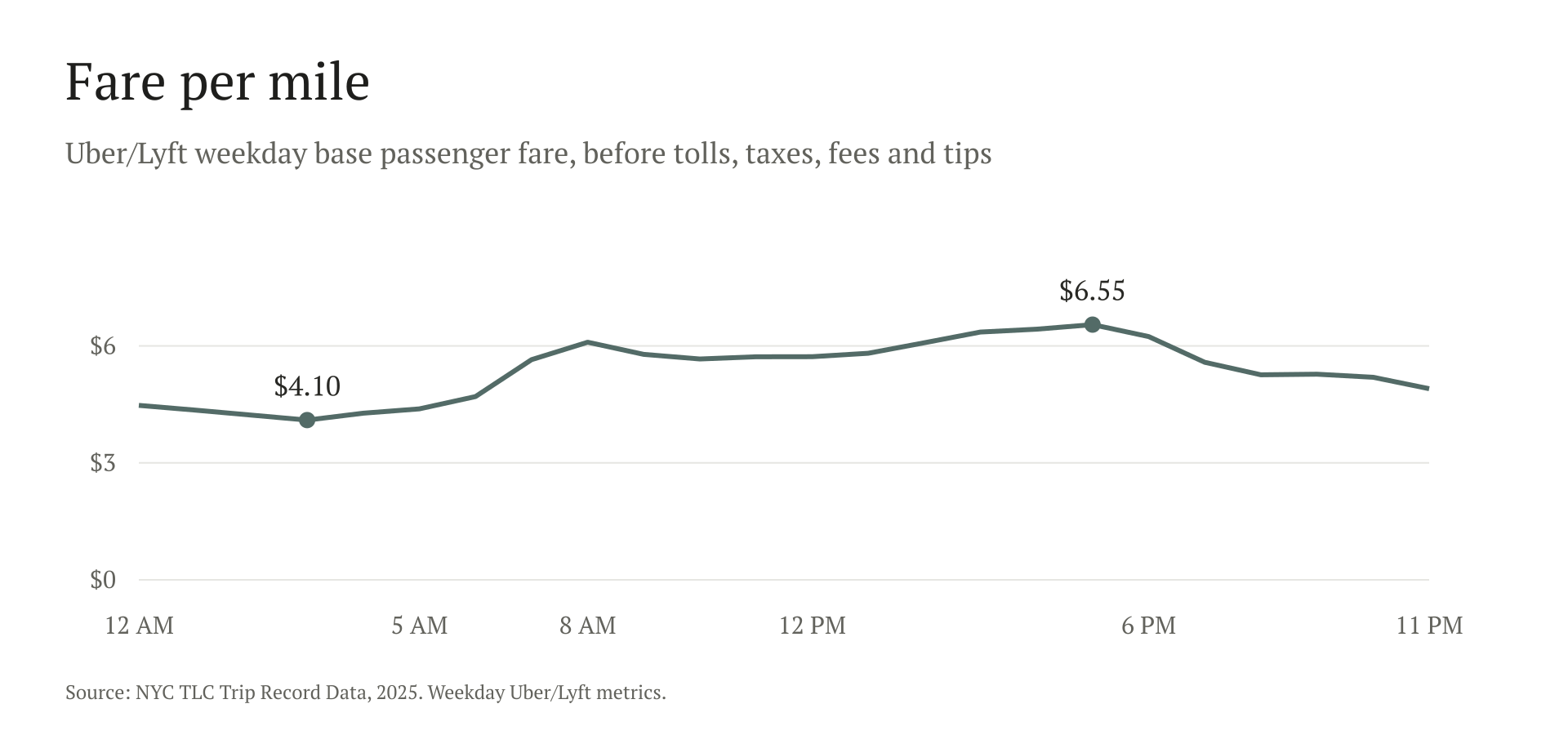
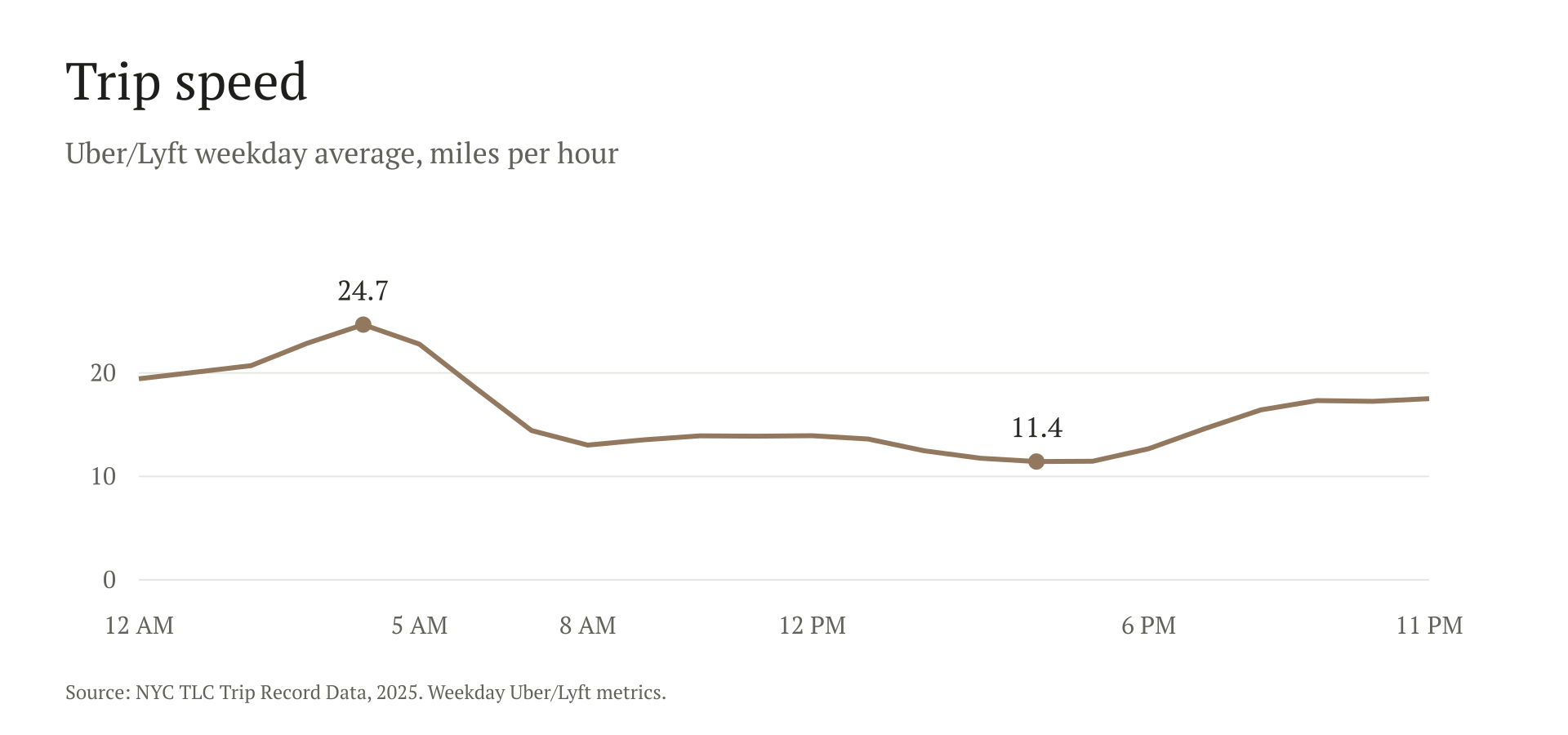
Figure 7. Weekday Uber/Lyft metrics. Base fare per mile is a pricing proxy, not a measure of total rider cost.
The evening slowdown in Figure 7 matters to the positioning question because moving a vehicle to its next pickup also takes time. It gives a reason to test whether staging vehicles before the evening flow develops works better than responding once it is underway. These averages do not measure empty travel or establish why fares are higher, so they cannot tell us how much such a change would help.
But evening is not when long waits are most common. The share of waits over 10 minutes is highest at 4 AM (9.1%) and 7 AM (9.0%), and lowest at 10 AM (3.1%). At 4 AM, these trips are also moving fastest. Faster travel once a ride begins can coexist with a long wait for it to arrive. Alongside the early-morning pickup-dropoff gaps, that makes coverage before dawn worth testing, without proving that vehicle location explains the waits.
As with demand, the timing is only part of the story. In Figure 8, Staten Island’s over ten minutes wait share is 14.3%, compared with 4.7% in Manhattan. The borough averages help locate the issue, while the local hotspots give it a more specific shape. A plan focused only on the largest number of completed trips could miss these less reliable places.
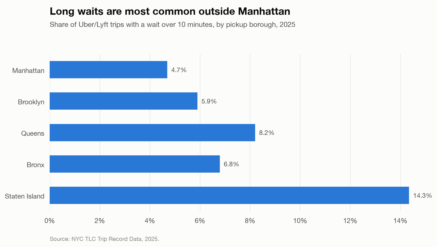
Figure 8. Borough-level wait time shares
When the weather changes
The recurring pattern is only a starting point for that plan. On heavy-rain days, the increase in completed trips appears alongside a larger proportional increase in the long-wait share. In the original all-service comparison, trips on heavy-rain days are 4.3% above comparable days, while the long-wait share is 24% higher. For Uber/Lyft, mean wait is 6.4% higher, speed is 2.2% lower, and fare per mile is 6.8% higher. Light rain shows no measurable effect.
There are only 8 days with at least 1 inch of rain in this comparison. Weather comes from a single station, measured daily. The results describe associations, with each day compared against the median of non-holiday days in the same month and weekday.
The largest snowstorms also stand out. On February 8 (3.0 inches), long waits are 62% higher. On December 14 (2.9 inches), long waits are 52% higher and fare per mile 14% higher. Those are individual days, and should be read with that limitation in mind.
The additional daily model in Figure 9 looks at completed trips separately by service, while accounting for month, weekday, holidays, and the year-end period. Heavy rain is associated with 7.1% more Uber/Lyft trips. The Yellow and Green Taxi estimates are also positive, but their uncertainty ranges include zero, so the model does not establish a clear increase for either service. Days with a high of 90°F or above are associated with 5.3% more Uber/Lyft trips and 6.9% more Yellow Taxi trips.
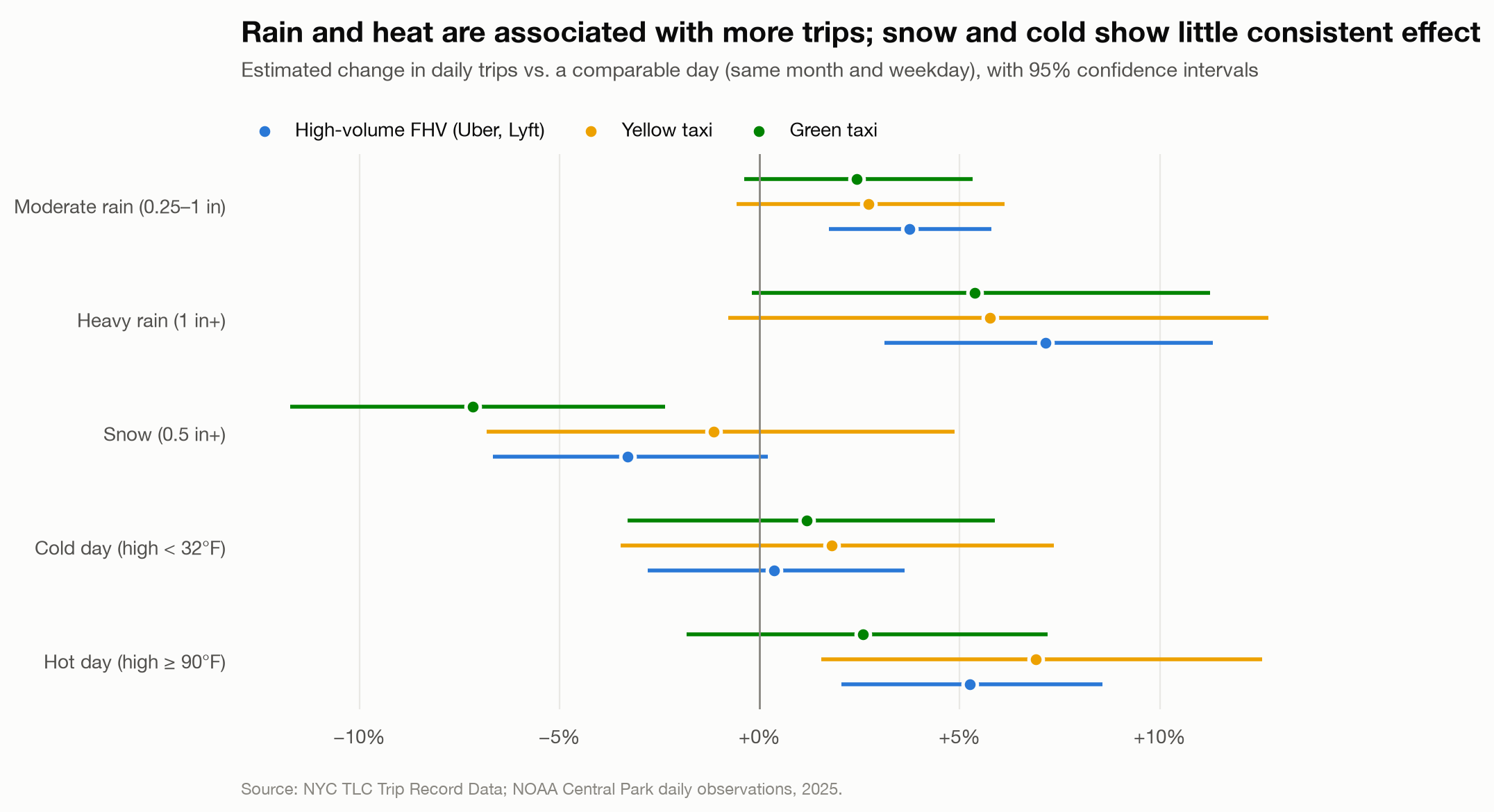
Figure 9. Daily regression estimates for completed trips in 2025, controlling for month, weekday, holidays and the December 24-31 period. Lines show 95% confidence intervals. Intervals crossing zero leave the direction uncertain. These are associations, not causal effects, and this model does not estimate wait times.
This is a different comparison from the earlier all-service figures, and it measures trip volume rather than waits. Its weather terms make a much smaller difference when aggregated across a month: the modeled contribution is about 2% at most across the services. Under this model, weather accounts for only a small part of the broader monthly variation, alongside seasonal dips of about 15% for Yellow Taxi. The holiday associations are larger than these modeled monthly weather contributions, though they describe different comparisons. That leaves a useful distinction for planning: prepare for difficult weather on individual days, while also adjusting expectations for the calendar and the time of year.
The weather insight is about reliability, not just extra orders. A small contribution to monthly volume can coexist with difficult conditions on the days riders most need a dependable service. I would use the calendar to plan the normal fleet, then test a separate severe-weather response: offer advance availability incentives in places with recurring long waits and adjust them using live requests and cancellations. Success would mean fewer failed requests and shorter waits without simply drawing drivers away from neighboring areas. These records motivate that test; they cannot establish the incentive required, the number of missing orders or whether the response would work.
Airports
The airports bring the positions questions into sharper focus: large local pickup–dropoff gaps occur alongside long rider waits in the evening. That combination makes them useful places to test the proposed staging approach. During the evening, from 8 PM to 12 AM, La Guardia has a net deficit of roughly 1,080 vehicles/hr. At the same time, 34% of its Uber/Lyft riders wait over 10 minutes. JFK has a deficit of about 750 vehicles/hr and a long-wait share of 23%.
Trips leaving the city reach about 6% of pickups at 10 PM, compared with 3-4% during the day. Including trips ending outside of NYC or at Newark Airport. These outbound trips add another consideration for evening coverage, although records do not show when the vehicles return. The airport gaps and waits identify a priority for testing, rather than an exact number of extra vehicles to send.
At an airport, “send more cars” is only one possible response. The useful question is where the delay occurs: before a driver accepts, while a vehicle waits to reach the pickup area, or as vehicles leave without returning promptly. These records cannot distinguish those mechanisms. Linking request, dispatch and pickup-area queue records would let an airport operator choose between an availability incentive, a dispatch change and a pickup-access change. Sending vehicles without that diagnosis could add waiting vehicles without shortening riders’ waits.
04
How the market is changing
The daily pattern sits inside a changing market
The daily patterns identify places and times worth watching. But a plan built on them also needs an up-to-date view of how many trips each service is carrying. In January–August 2026, raw records across all services rose from 191.9M to 198.2M compared with the same period in 2025, an increase of 3.3%.
Figure 10 shows the services moving in different directions. Uber/Lyft grew 5.2% and was higher in every month. Yellow Taxi fell 5.9%, with fewer records in every month since February, reversing its growth in 2025. Green Taxi fell 15.3%. The citywide total therefore gives an incomplete guide to the volume a particular service should plan for.
The competitive reading is narrower than “ride demand is growing.” The market is expanding in aggregate while the services capture different parts of that expansion. That makes a uniform fleet-growth assumption difficult to defend. It also does not prove that individual riders switched from taxis to Uber/Lyft: these are service totals, not linked customer journeys. The next distinction—how taxis were booked—offers a more useful starting point for strategy.
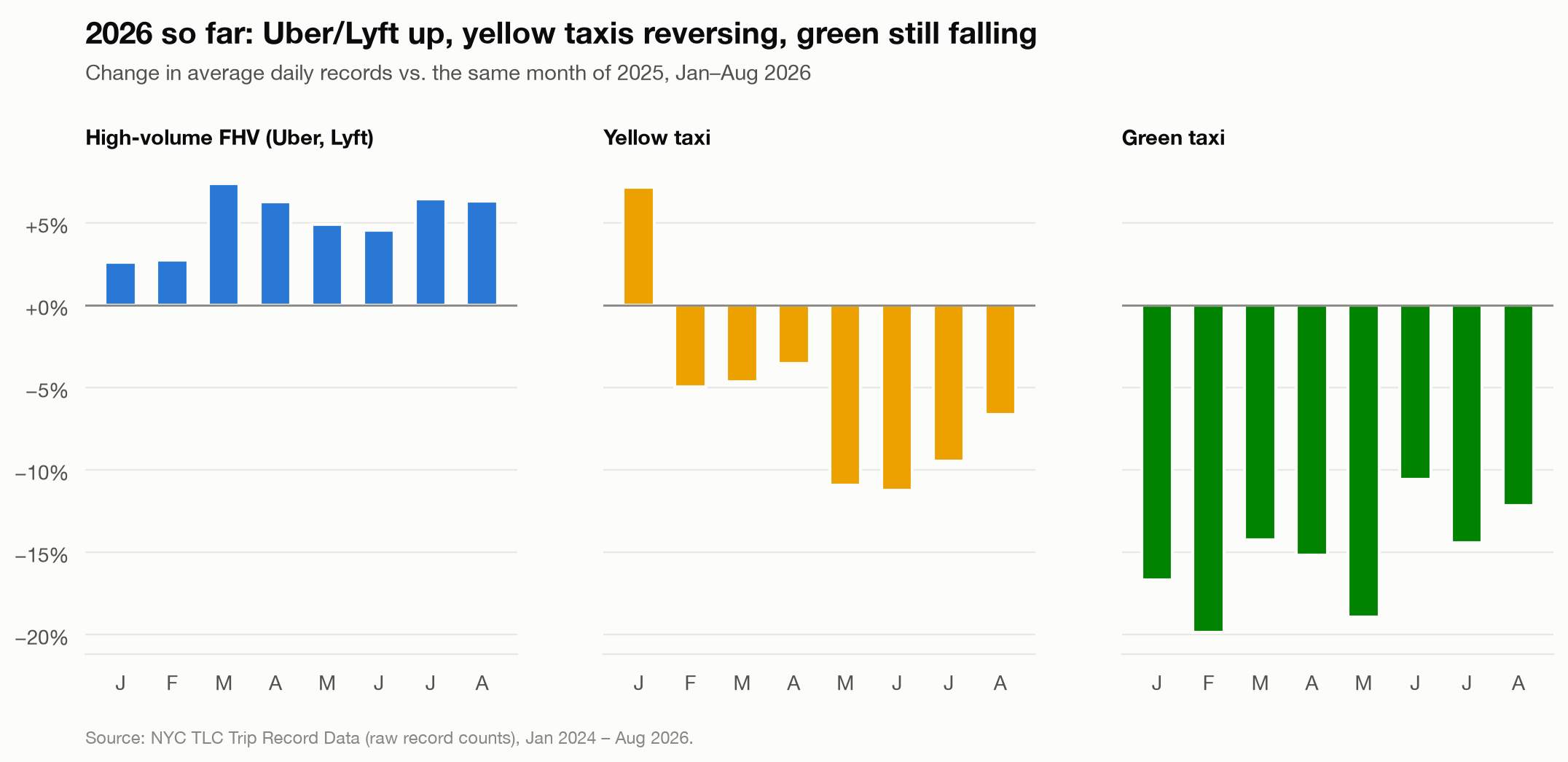
Figure 10. Change in average daily raw records against the same month of 2025. These counts precede cleaning and should not be compared directly with the article’s cleaned 2025 totals. THe chart describes changes in volume, not their causes.
Forecast comparison and an outlook for the remaining months
Before carrying a trend forward, I wanted to compare it to previous forecasts. Figure 11 below compares a forecast using information available at the end of 2025 with records observed through August 2026. Its dashed lines show that earlier prediction, not the updated outlook that follows.
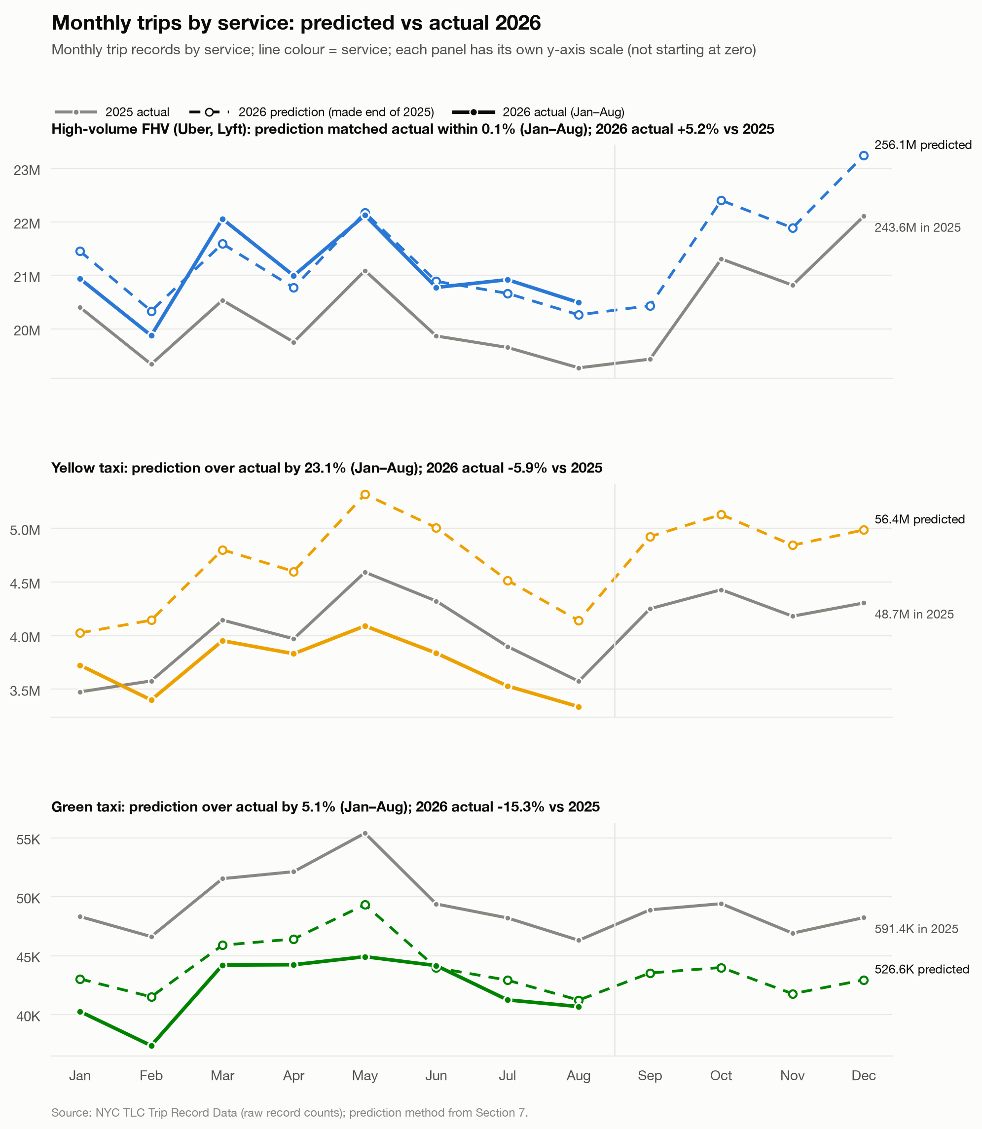
Figure 11. Dashed lines show the 2026 prediction, and solid colored lines show observed records through August. Each panel uses a different vertical scale that does not begin at zero. The error summaries compare January–August totals, not accuracy in each individual month.
The earlier forecast was close to the combined January–August total for Uber/Lyft, while it overpredicted Yellow Taxi by 23.1% and Green Taxi by 5.1%. Yellow Taxi is the important contrast: its earlier growth did not continue into the observed period. A familiar seasonal shape was not enough to protect a forecast from a reversal in the overall trend. Conversely, a close math to Uber/Lyft’s cumulative total does not mean every month was predicted equally well.
For planning, this is a reason to revisit assumptions by service as new records arrive. An operator carrying the earlier taxi growth expectation into staffing or vehicle commitments would be planning against a substantially different volume from the one observed. The comparison does not identify why that reversal occurred or translate the forecast error into excess vehicles. It shows why a forecast should be a reversible planning input rather than an annual commitment.
Updating the outlook with the observed trend
The revised projection below incorporates the published January–August records and uses the more recent trend for the remaining months. Its full-year totals therefore differ from the earlier prediction in Figure 11. That distinction is especially important for Yellow Taxi: the two forecasts reflect different information about the direction of the market.
The updated monthly projection carries the most recent 3-month growth rate forward over the same months of 2025, preserving that year’s seasonal shape. For September–December 2026, it puts Uber/Lyft about 5.8% above 2025, Yellow Taxi about 9.3% below, and Green Taxi about 12.3% below.
Combining those projected months with the published records gives the full-year outlook in Table 1. These are projected raw records, not an extension for the cleaned trip total used earlier.
Table 1. Updated full-year 2026 projection
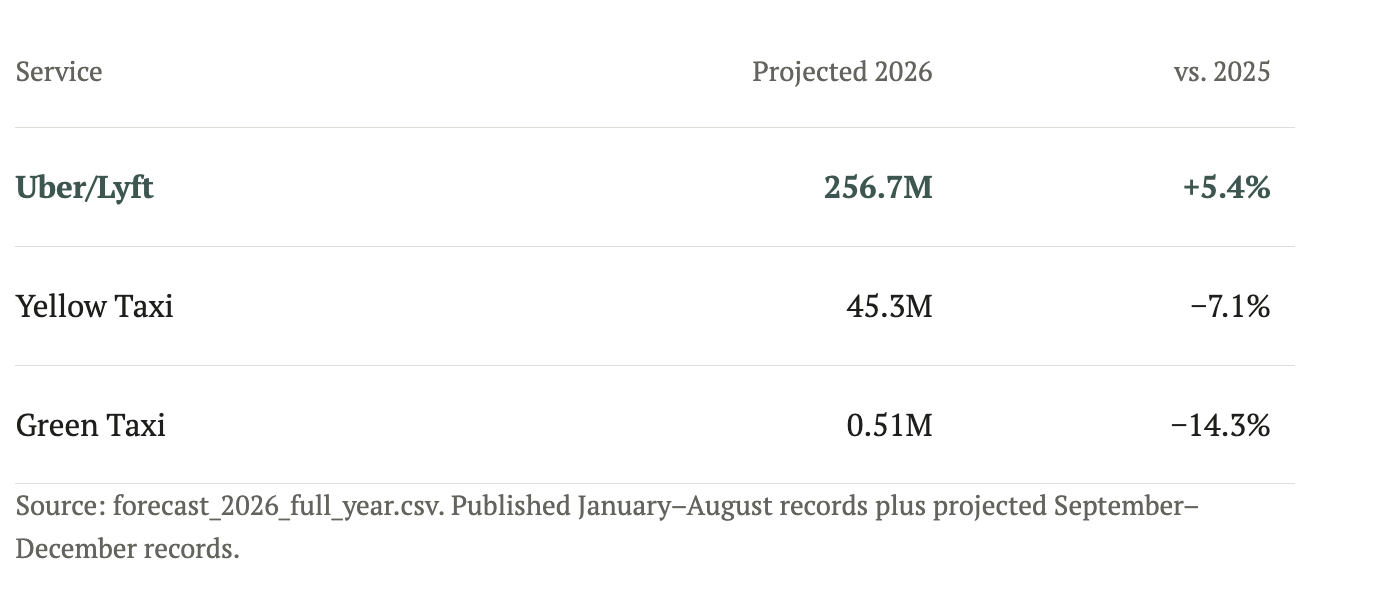
Published January–August records plus projected September–December records
The chosen method’s mean absolute percentage error in backtesting was about 2–4% per month across services. That is an average error summary, not a guarantee for each future month. The projection assumes recent growth and the seasonal shape persist; it cannot anticipate a further reversal. The project expects September 2026 data around November 2026, providing the next opportunity to compare the outlook with actual records.
05
Policy changes and the evidence
A longer view before looking at policy
The recent changes look different when placed against the longer records. Figure 12 follows each service relative to its own average in 2019. The sharp fall around the pandemic is shared, but the paths afterward separate: Uber'/Lyft comes much closer to its earlier level, while Yellow and Green Taxis remain further below theirs. These are changes relative to each service’s own starting point, not market shares.
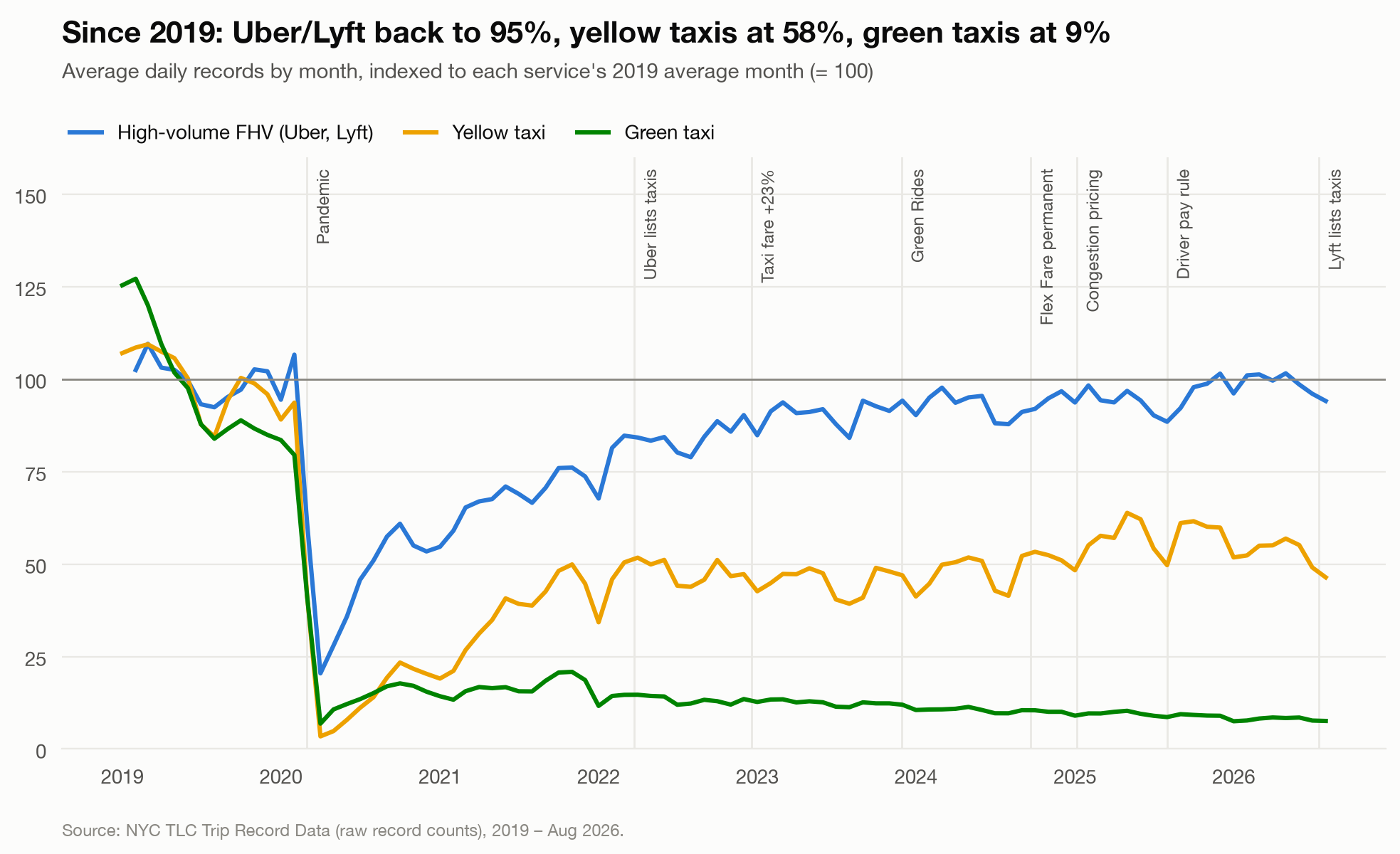
Figure 12. Average daily raw trip records by month, indexed to each service’s 2019 average. The headline percentages summarize 2025 relative to 2019; they are not the August 2026 endpoints. Uber/Lyft’s available 2019 series begins in February. Vertical markers locate events in time, not their causal effects.
Against that backdrop, different policies tried to solve different problems: driver income, access to bookings, emissions, accessibility, and congestion. I look at what each change was intended to do before asking what happened afterward. The event markers in Figure 12 locate changes in time, not their effects.
December 2022: Raising taxi fares to support driver income
On December 19, 2022, the New York City Taxi and Limousine Commission (TLC), which licenses and regulates the city’s taxis and for-hire services increased metered taxi fares and several surcharges. The change followed a long period without fare increase, while inflation and operating expenses put pressure on drivers. The intended benefit was better income from taxi work. A higher fare could raise receipts per trip, but the outcome would also depend on how many trips drivers completed and what it cost to serve them. TLC fare rule; TLC policy background.
Figure 13 compares Yellow Taxi and Uber/Lyft trip volumes with the same months of 2019. In the analysis’s before-and-after comparison, Yellow Taxi fell a further 10 percentage points behind Uber/Lyft. That gives a reason to examine whether stronger receipts per ride were accompanied by fewer rides. It does not show that the fare increase caused the relative decline, or that driver income fell.
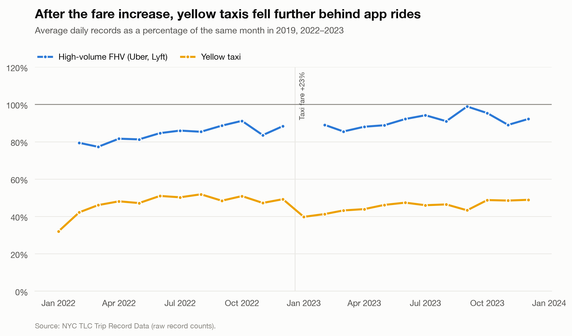
Figure 13. Monthly raw records relative to the same month of 2019. The reported before-and-after comparison uses February–November in each year. This measures relative trip recovery, not driver earnings or a causal fare effect.
The lesson is to judge an income policy with income evidence. To decide whether this change helped drivers, I would need net earning over their working time, including expenses and time without a passenger. But that serves as an unrealistic analysis, and trip volume alone cannot settle the question.
2022–2024: Bringing taxi bookings into apps
Uber’s taxi integration in 2022 was an industry partnership, rather than a city policy. It gave taxis another way to reach passengers through an app. Separately, TLC made Flex Fare permanent in September 2024: app-booked taxi trips could continue using an upfront price instead of the metered fare. This gave passengers a price before booking and taxis a way to compete for app-based requests. The expectation was more booking opportunities, not a guarantee that every additional booking would improve driver earnings. TLC’s Flex Fare description; rule timeline.
The available booking breakdown starts in January 2024, after Uber’s integration, and continues through August 2026. It includes months before and after Flex Fare became permanent, but that decision continued an existing pilot rather than introducing app bookings for the first time. Figure 14 therefore shows how the booking mix developed later; it does not measure the initial effect of Uber’s integration or isolate the effect of making Flex Fare permanent.
Within that later period, Figure 14 answers a narrower question: which bookings account for Yellow Taxi’s recent growth and decline? App-booked trips account for nearly all of its growth in 2025. When total trips declined in 2026, the decline came from metered trips while app-booked trips held steady. Flex Fare includes bookings from taxi apps as well as platform dispatches, so the chart cannot identify Uber’s contribution separately.
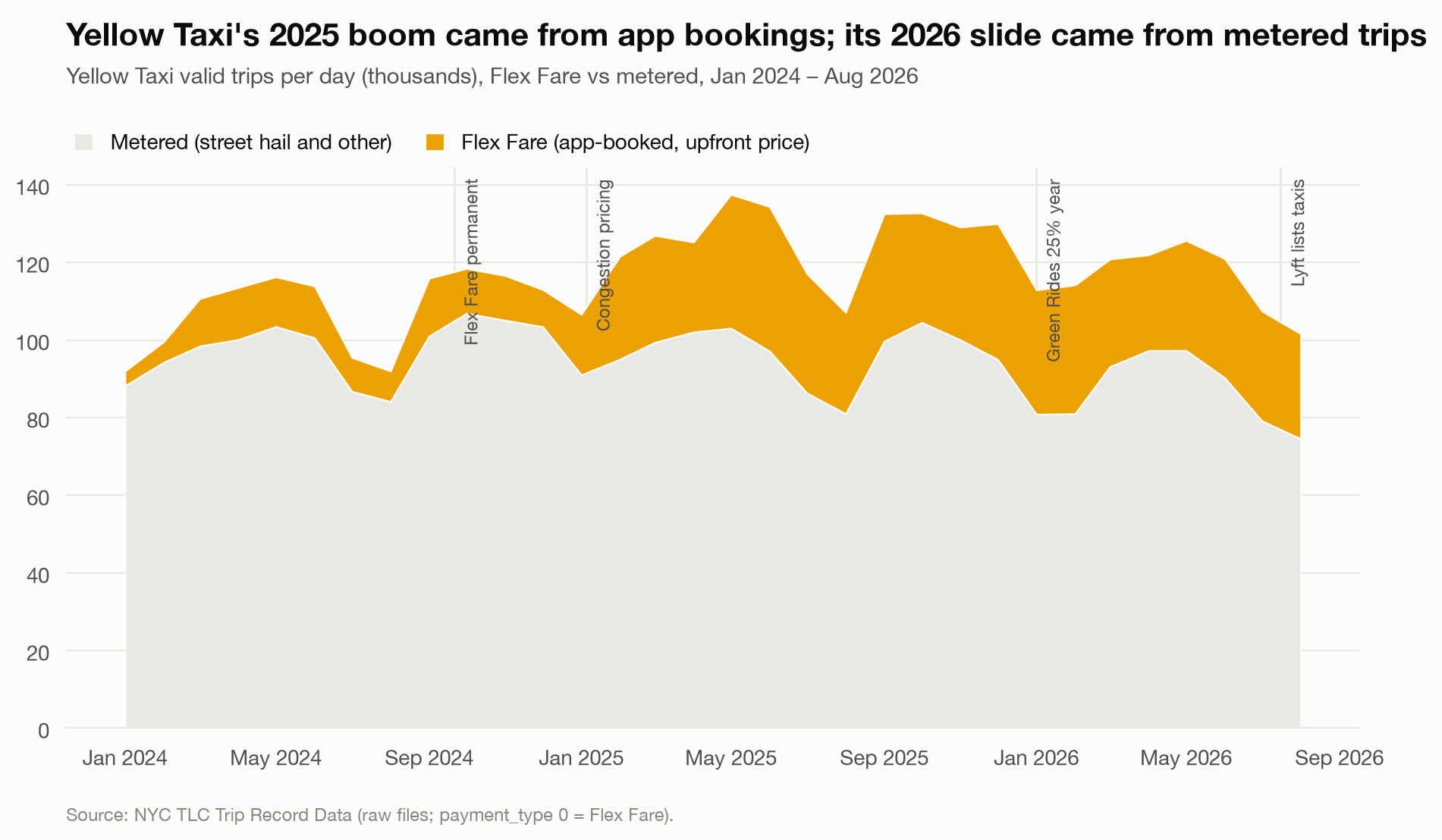
Figure 14. Yellow Taxi trips by booking type, January 2024–August 2026. This period begins after Uber’s taxi integration. The Flex Fare marker indicates when an existing pilot became permanent, not when app bookings began. The comparison describes later booking trends rather than a causal policy effect. Metered trips include street hails and other bookings; Flex Fare does not identify a specific booking platform.
For taxis, the competitive question is therefore also about how passengers find them. A platform can compete with taxis and provide their bookings at the same time. The pattern in Figure 14 supports examining those partnerships, but their value to drivers still depends on fees, empty travel and whether the bookings add work rather than replace another source of trips.
2023 onward: Cleaner and more accessible rides
Adopted in 2023, the Green Rides Initiative requires a growing share of Uber/Lyft trips to use zero-emission or wheelchair-accessible vehicles. Its purpose is to move the industry toward cleaner transport and better accessibility. The expected outcome is a change in the vehicles serving trips; growth in taxi bookings is not its objective. Green Rides rule and purpose.
The project cannot directly assess electrification because these trip records do not identify electric vehicles. It can examine a narrower concern: whether the taxi decline coincided with fewer app-booked taxi trips. Figure 14 shows that those bookings held steady while metered trips declined. That does not support an explanation based on a broad fall in app-booked taxi trips, although bookings through individual platforms cannot be separated here. It is not a verdict on whether Green Rides met its environmental or accessibility goals.
January 2025: Charging for trips in the congestion zone
Congestion pricing began on January 5, 2025. It charges for vehicle travel in Manhattan’s congestion zone, with taxi and app-based rides using a per-trip charge. The purpose is to reduce traffic and fund public transit. The expected benefit is less congestion and better transport, not simply fewer recorded taxi or Uber/Lyft trips. MTA launch and charging overview; transit funding purpose.
Figure 15 compares pickup growth inside and outside the zone. Uber/Lyft pickups inside grew about 8 percentage points less than outside in both 2025 and 2026, using January–August comparisons. This is consistent with a relative shift in where app rides begin. It does not establish that congestion pricing caused the gap: the areas may differ in other ways, and other changes occurred at the same time.
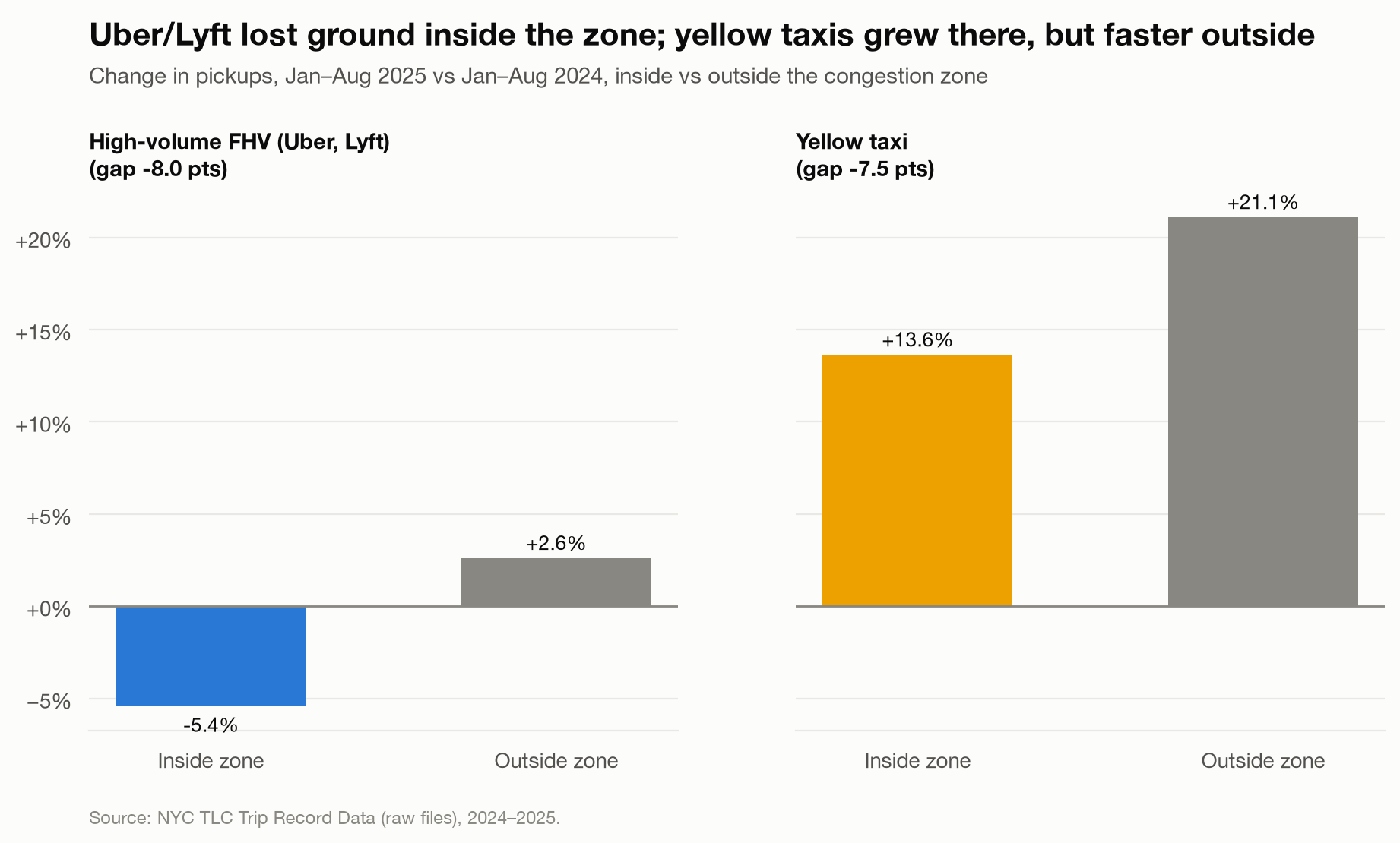
Figure 15. January–August pickup-growth comparison. The analysis also finds the inside–outside gap persisting for Uber/Lyft in 2026. The comparison is observational: other differences between areas and changes over time may contribute.
The distinction is important for evaluating the policy. A shift in pickup locations is relevant to fleet planning, but it cannot tell us whether traffic moved faster, riders switched to transit or some trips were abandoned. Those outcomes require traffic, transit and request data. The evidence here describes a change in the ride market, not the overall success of congestion pricing.
On a personal note, this has changed how I think about visiting the city too. I usually drive into New York, but with the added toll, I find myself questioning whether it is worth it. That hesitation makes the policy’s intention feel less abstract: I am reconsidering a trip I would otherwise have made by car.
August 2025: Protecting pay across drivers’ working time
The revised high-volume driver-pay rule took effect on August 1, 2025. It raised the minimum per-mile payment to reflect expenses, changed how time spent serving passengers enters the pay formula, and introduced protections against companies restricting driver access to their apps. The aim was to better account for drivers’ costs and working time, including time between passenger trips. TLC driver-pay rule.
In this analysis, pay per hour of passenger time rose 3–4% after the change, in line with the trend already underway. Figure 16 shows no clear jump at the rule’s introduction. This measure excludes time waiting for requests and traveling to pickups, and it does not deduct operating expenses. It is not an hourly wage.
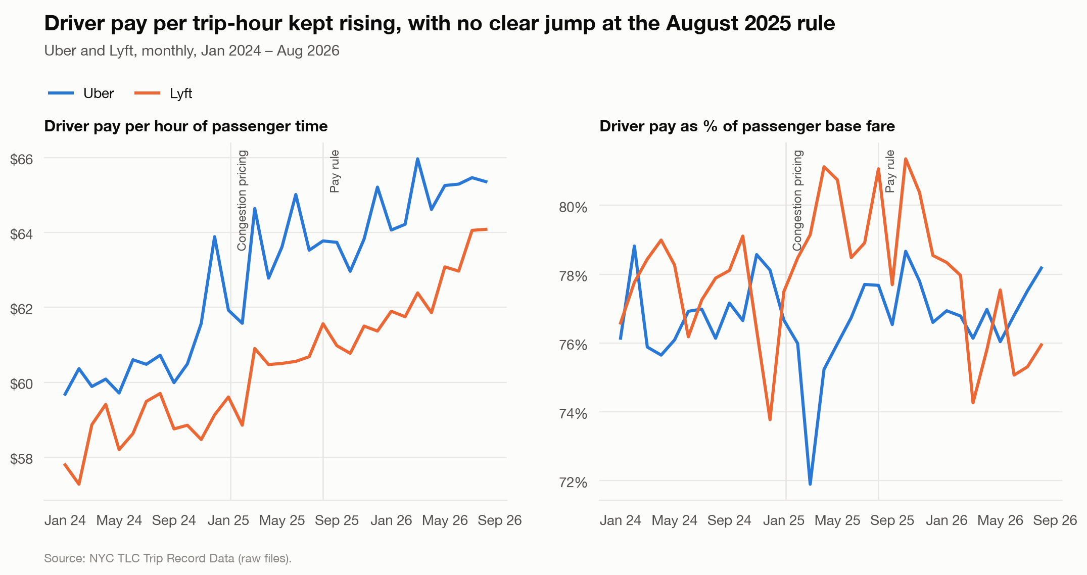
Figure 16. Pay during passenger trips and pay as a share of passenger base fare, by company. Neither measure establishes net earnings over all working time. Policy markers show timing, not causation.
That measurement gap matters because the policy explicitly addresses time outside passenger trips. The absence of a jump in Figure 16 is not proof that the rule failed. An evaluation would need online time, access restrictions, expenses and take-home pay, alongside completed trips.
What this means for the positioning question
The strongest booking signal is that app access became more important to taxis. The fare and pay comparisons show why trip counts cannot stand in for driver welfare. The congestion comparison shows why a location shift cannot stand in for better transport. Each change needs to be judged against the problem it was meant to address.
For this project, that brings the focus back to reliable service. A targeted positioning trial should ask whether riders can obtain a ride more easily and drivers can serve it sustainably. I would test availability incentives in places and periods with recurring long waits, while checking cancellations, driver net earnings, empty travel and waits in neighboring areas. This is a proposal to evaluate, not a demonstrated policy benefit. The next section turns those questions into a practical test.
06
What positioning could look like
Looking ahead to the next day
The monthly outlook describes a changing market baseline. Positioning within the city calls for a more local forecast: how well can the next day’s demand be anticipated by zone and hour? The separate 2025 evaluation addresses that question. In Figure 17, a day-ahead regression produces zone-hour error of 17.3% WAPE, compared with 18.8% for a four-week average and 22.1% for the same hour last week.
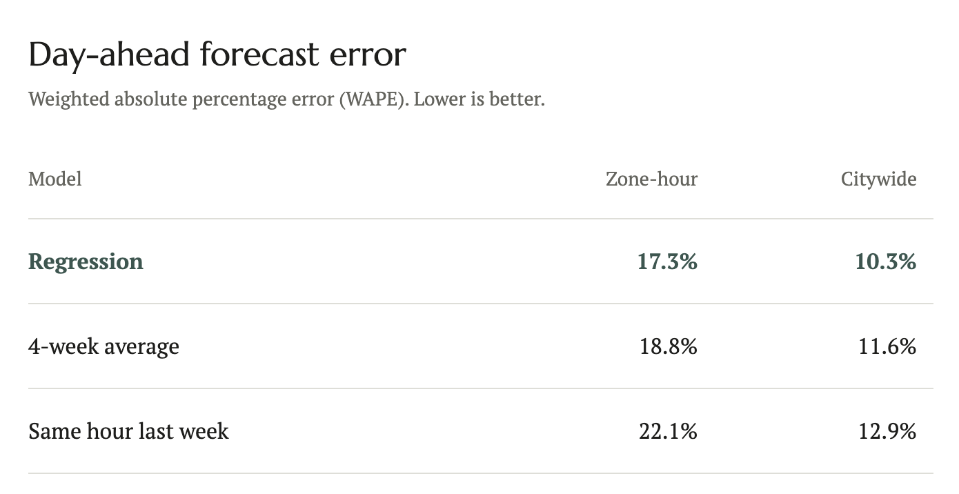
Figure 17. WAPE is total absolute error divided by total actual trips. The forecasts use observed weather, so the results assume accurate day-ahead weather information.
Forecast accuracy is useful only if it improves a decision. This model predicts completed trips, so using it alone to allocate vehicles risks repeating the service pattern already visible in the data, including places where few riders are completed because access may be poor. A dispatch journey trial should therefore compare both operational outcomes and coverage, rather than reward forecast accuracy alone. Request and cancellation records would be needed to distinguish low demand from demand that the existing service fails to capture
A positioning plan that changes with the day
Read together, the timing, vehicle balances and rider waits suggest a sequence of positioning priorities to test. Before dawn, stage vehicles in residential Manhattan and Queens. During the AM peak, serve residential Manhattan. For the PM peak, move supply back toward Midtown. In the evening, prioritize LaGuardia and JFK.
Those daily positioning priorities sit within a changing monthly baseline. The seasonal and holiday patterns suggest adjusting expected volume by service and calendar, while the weather findings support preparing for additional demand on heavy-rain days. They do not establish an exact fleet size or how seasonal changes are distributed across zones. At the city’s edges, particularly Staten Island and the Rockaways, structurally long waits point toward dedicated coverage alongside the daily repositioning plan.
To test these priorities, I would start with a small fleet pilot, comparing the proposed positioning plan with current practice across comparable days and time periods, randomly assigning the approach where feasible. The evaluation would track rider waits, travel without passengers and the share of drivers’ online time spent serving trips, while checking whether improvements in the target zones come at the expense of nearby areas. That would require a fleet partner and additional records of vehicle movements, online time and ride-request outcomes. This would be a separate operational study to establish whether the patterns here translate into better service.
The question began with where and when rides happen. The more useful conclusion is that trip growth, rider access and driver returns need separate attention. The daily pattern helps identify where reliability deserves investigation; the weather results show why monthly averages can conceal difficult days; and the taxi split makes booking channels part of the competitive story. Better positioning is one tool within that larger problem. I would judge its success—and any policy built around it—by whether riders can obtain a ride more reliably and drivers can provide it sustainably, not simply by whether another trip appears in the total.
My takeaway
The questions behind this analysis came from my previous experience in fleet operations at a taxi company in Indonesia. I wanted to bring that experience into a study of a different city: to look at where rides happen, how vehicles move, and what the records might tell someone making decisions about a fleet. Back in Indonesia, analyses like these were a daily occurrence, but for shorter time periods as historical and policy-related information weren’t as relevant. So, completing this research was not too far out of my typical analyses done at the taxi company.
New York’s yellow taxis were part of the reason I chose this city. They have been in so many films, and continue to be an icon in the streets of New York it almost feels inseparable. I was curios about the business behind that familiar image. As booking habits and competing services changed, what happened to the taxis?
The booking breakdown gave me one answer. Yellow Taxi’s recent growth came largely through app-booked trips, even as the later decline came from metered trips. That made the relationship with platforms more interesting than a simple story of taxis losing to apps. The vehicle can still be a yellow taxi while the way a passenger finds it changes. For someone with a fleet-operations background, that is a useful reminder to look beyond the vehicles themselves and consider how work reaches them.
I also learned to be more careful about what a number represents. A completed trip is not the same as a request. A gap between pickups and dropoffs is not a count of missing vehicles. Faster trips do not necessarily mean shorter waits for a ride. Those distinctions changed how I read the results and what I was willing to conclude from them.
The biggest lesson was that finding a pattern is only the beginning. I had to keep asking why it mattered, what decision it could inform, and what evidence would be needed to test that decision. The analysis helped me identify places and times worth investigating, but it could not tell me exactly how many vehicles to send or whether a policy made drivers better off.
I started with curiosity about a familiar symbol of New York and ended with a more specific question about the work behind it: how can a fleet adapt as the city and its passengers change? I would like to take that question back into an operational setting, test a small change, and see whether it improves the experience for both riders and drivers. Finally, learning how to move from an observation to a testable decision has been the most valuable part.
-
What the records capture
The analysis uses NYC TLC Trip Record Data, 2025, for Yellow Taxi, Green Taxi and High-Volume FHV. Validity checks remove trips with invalid duration, distance, speed, pickup zone or fare. Demand means completed trips. Unserved requests and abandoned searches are not observed.
Positioning and waits
Pickups minus dropoffs, averaged by zone and hour on weekdays excluding holidays, approximate vehicle imbalance. There are no vehicle identifiers, so actual repositioning and idle time cannot be measured. Waits are available for Uber/Lyft only.
Weather and timing
NOAA Central Park daily observations provide the weather data. Each day is compared with the median of non-holiday days in the same month and weekday. The measurements come from one station, and heavy-rain and snow samples are small. The results are associational.
The detailed trip, weather and positioning analysis covers 2025, beginning with the January congestion pricing launch. Part 3 adds a comparison with 2024 using raw monthly record counts. The expanded policy review spans 2019–2026, and the latest monthly counts extend through August 2026. Before/after and inside/outside comparisons do not isolate policy effects. This article does not treat the review’s “supported” verdicts as causal findings.
Monthly patterns and the daily model
Monthly 2025 volumes use cleaned trips per day. The average-month baseline gives each month equal weight. The 2024–2025 comparison instead uses raw record counts before cleaning, indexed separately within each service and year. Cleaning rates may differ between years. There are only twelve monthly observations per year, and explanations such as vacations or holiday travel were not directly tested.
The Part 3 regression models log daily completed trips by service, with month and weekday effects, a holiday indicator, a separate December 24–31 indicator, and weather indicators. Holiday and year-end terms are conditional estimates, not standalone observed declines or percentages to add together. The model is associational. Its conventional OLS confidence intervals do not adjust for serial dependence. It uses daily weather from a single station, with small samples for heavy rain (8 days) and snow (11 days under this model’s definition).
The monthly weather contribution compares model predictions using observed weather with predictions setting the weather indicators to zero. The difference is expressed as a share of the model’s predicted monthly trips. It is a model-based comparison, not a causal attribution or a decomposition of all monthly variation.
The 2026 monthly outlook
The projection applies recent 3-month growth to the corresponding months of 2025. It uses raw file record counts, unlike the cleaned 2025 demand analysis and the validity-filtered policy panel. It assumes the seasonal pattern and recent growth persist, with typical weather and holidays. Backtest error is an average across past forecast cases, not an error bound for each future month. The notebook’s ranges use the largest observed backtest errors and are not formal confidence intervals. This is a growth-on-seasonality projection, not a causal model, and differs from the day-ahead zone-hour forecast below.
Policy comparisons and fare consistency
The policy panel separates upfront-priced Flex Fare from metered taxi trips, but does not identify the booking app exactly. Metered trips are not exclusively street hails. The congestion comparison uses January–August in each year and compares pickup growth inside and outside the zone; it does not measure changes in traffic speed or rule out competing explanations. Pay per passenger-hour excludes idle time and empty travel. Electric-vehicle use is not directly observed, so the Green Rides outlook is conditional.
Forecasting
The regression uses recent demand, weather and holidays. Evaluation uses WAPE at the zone-hour and citywide-hour levels. Weather inputs are observed rather than forecast, which limits the interpretation of day-ahead performance.
